

About
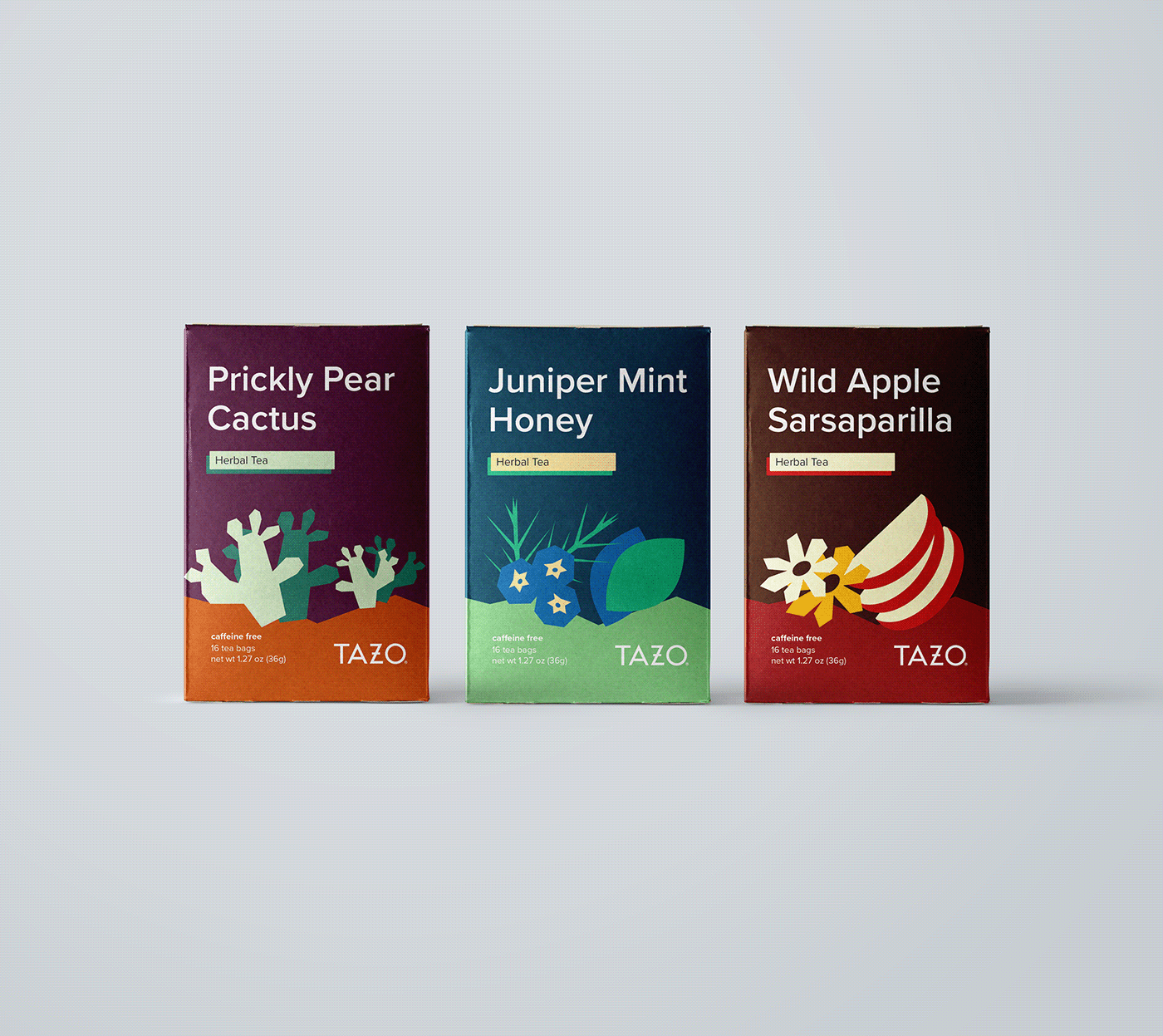
This is a packaging series of three designs for TAZO tea that uses the flavors Prickly Pear Cactus, Juniper Mint Honey, and Wild Apple Sarsaparilla. Each design features simple illustrations that symbolize the main ingredients, as well as a deeply saturated landscape that wraps around to one of the side panels. Color palettes reflect regions of the U.S. in which the main ingredient can be found, and are limited to 5 colors.
The overall typeface is Proxima Nova and was chosen for its round letterforms and subtle contrast in line weight. Almost all of the elements are left aligned, except for the TAZO logo which can be seen on the bottom right of both the front and top panels.


